
TLDR
Every successful SaaS site follows a proven structure.
You need sections like navigation, hero, features, pricing, and testimonials.
Each section helps guide visitors from awareness → trust → conversion.
Kompa includes all these sections (and 900+ more) ready to drag into Framer.
Used by the Framer team, Kompa saves freelancers and agencies hours per project.
If you’re building a SaaS website in Framer, there’s one thing you’ll notice fast — every great site follows a similar structure. Whether it’s Notion, Figma, or Linear, the pages look clean, fast, and familiar. Why? Because SaaS sites aren’t about being flashy — they’re about clarity, flow, and trust. Here are 10 sections every SaaS website needs (and how you can drag them straight into your project using Kompa
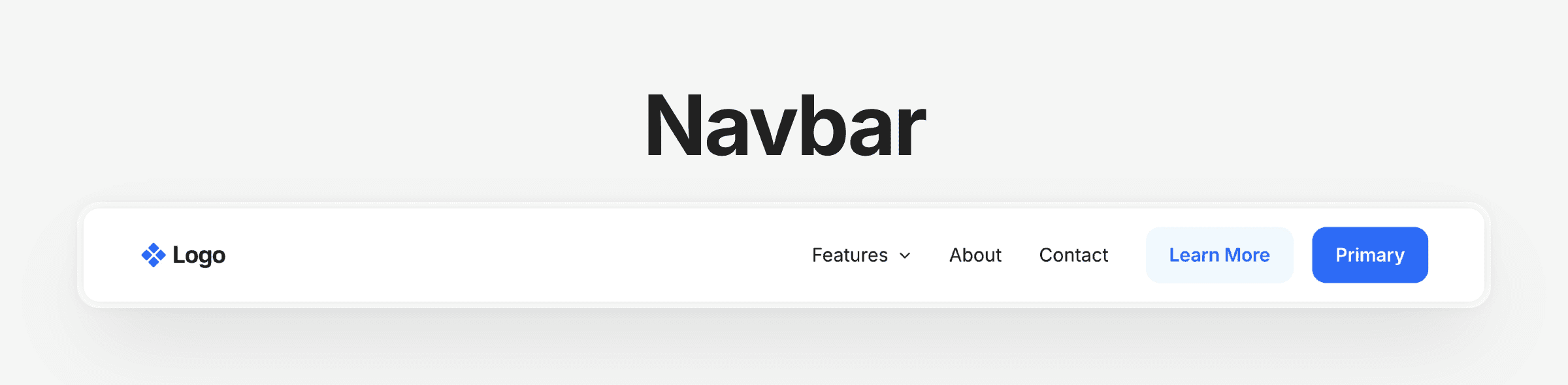
1. Navigation
Your navbar is the first (and often last) thing people click.
It should be clean, predictable, and work seamlessly on every device.
Keep it simple — a logo on the left, a few key links, and one clear call-to-action button (like “Get Started”).
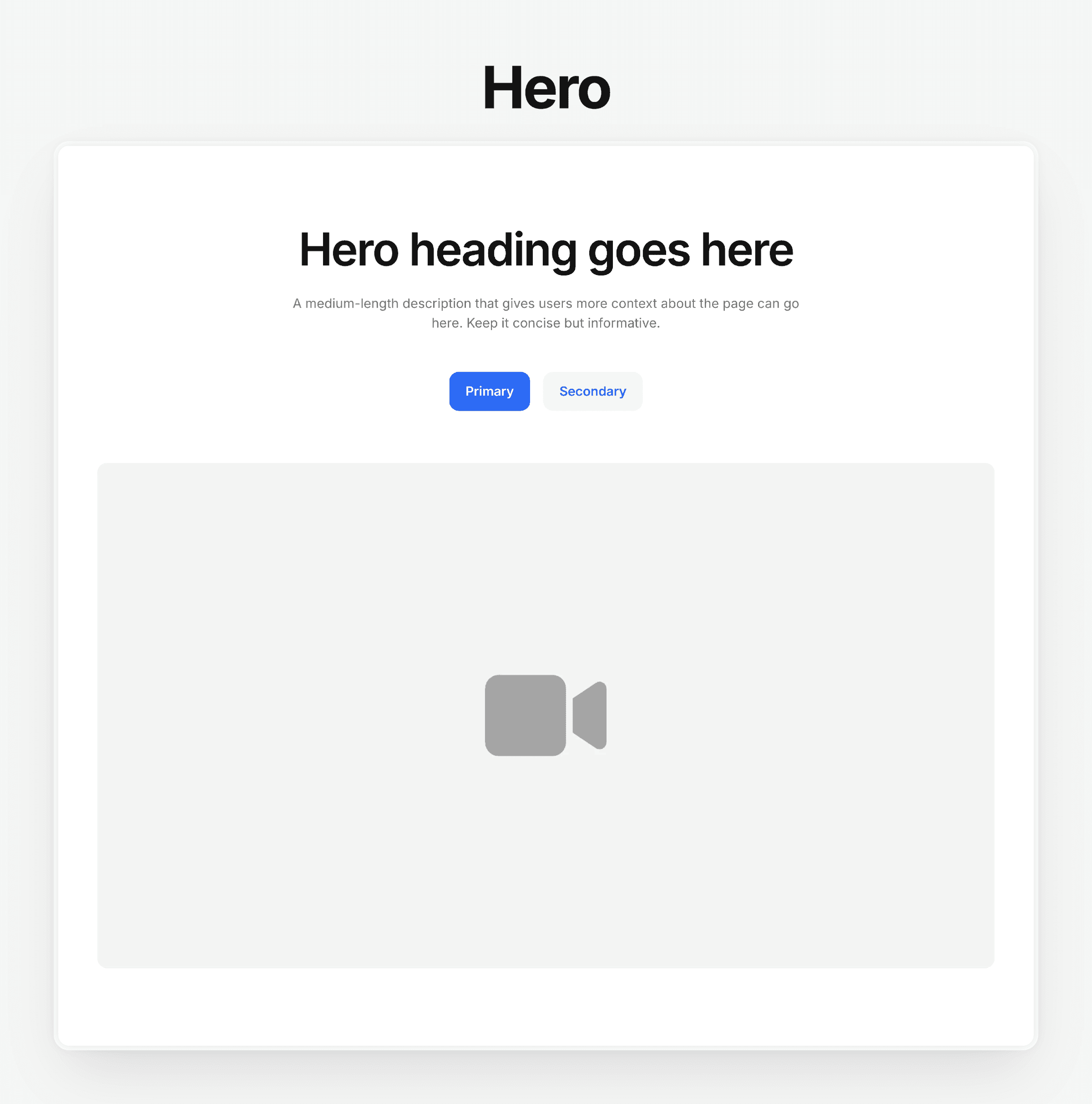
2. Hero Section
This is where you earn a visitor’s attention in under 3 seconds.
Your hero should clearly explain what your product does, who it’s for, and include a single call-to-action.
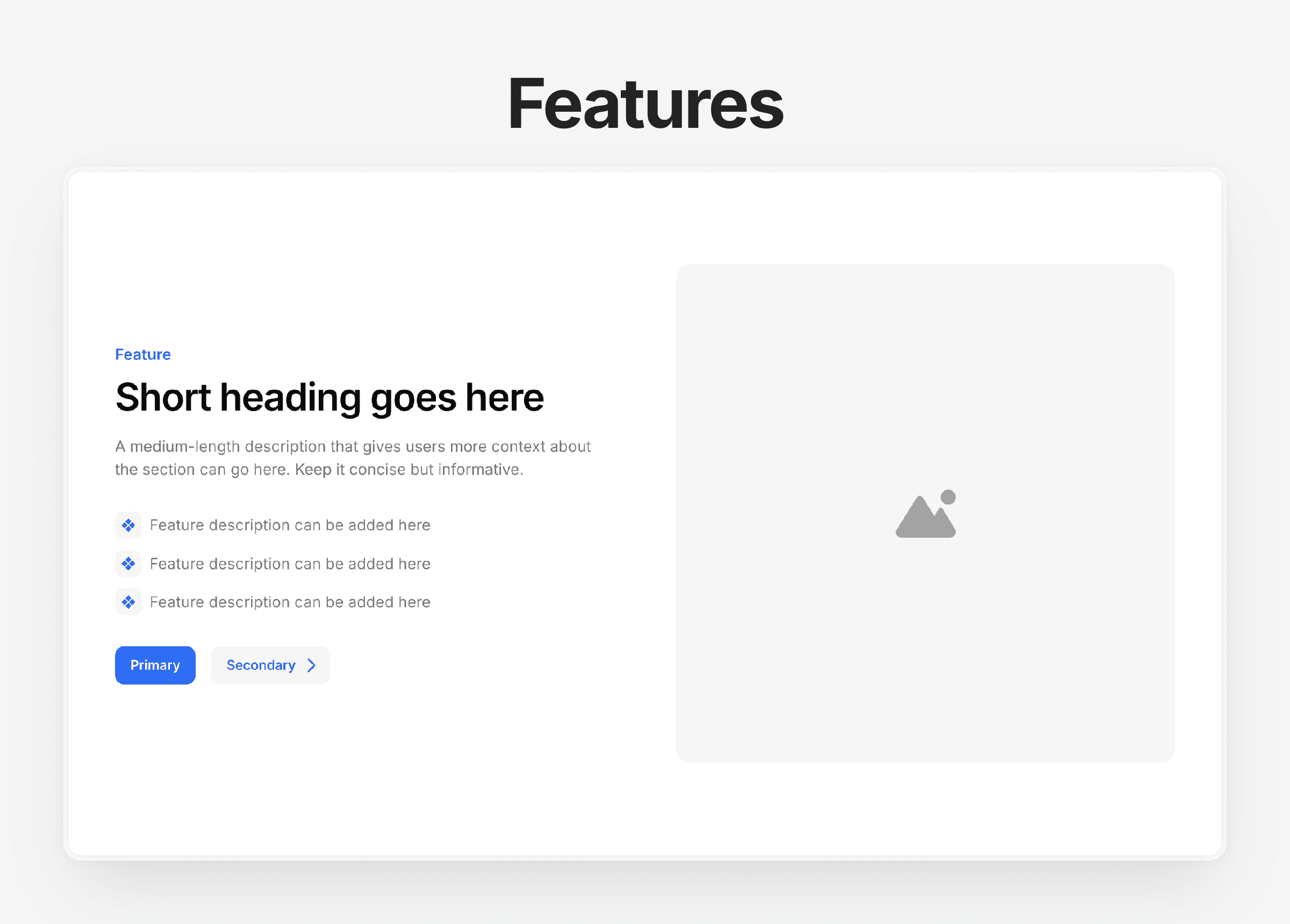
3. Feature Overview
Your features should be short, visual, and easy to scan.
Avoid walls of text — focus on how your product helps users, not just what it does.
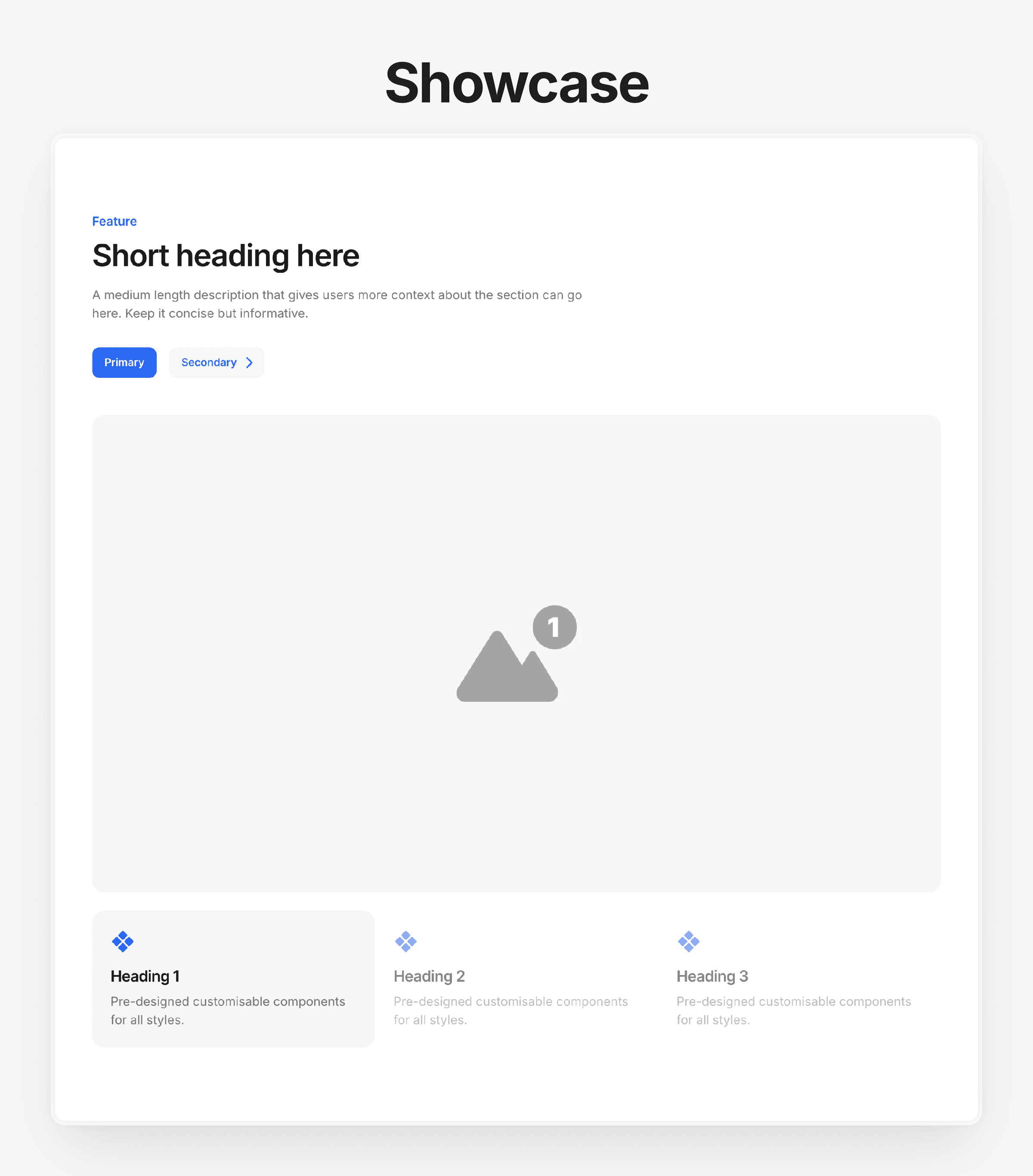
4. Product Showcase
Show, don’t tell.
Add screenshots, short loops, or before-and-after sliders to demonstrate your product in action.
👉 See more product showcase sections
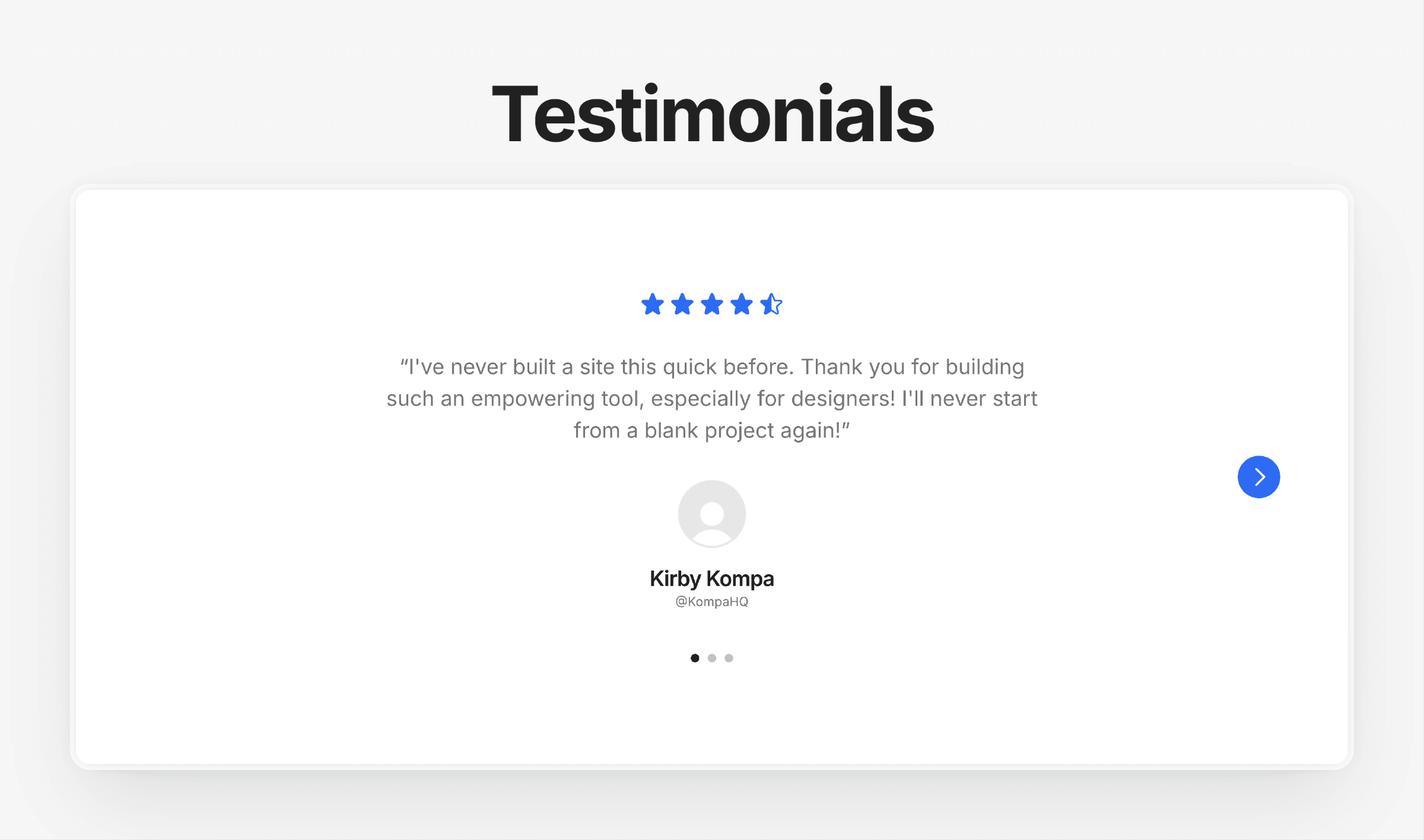
5. Social Proof / Testimonials
Real quotes from real users = instant credibility.
Keep them short and include names, photos, and company logos if possible.
👉 See more testimonials sections
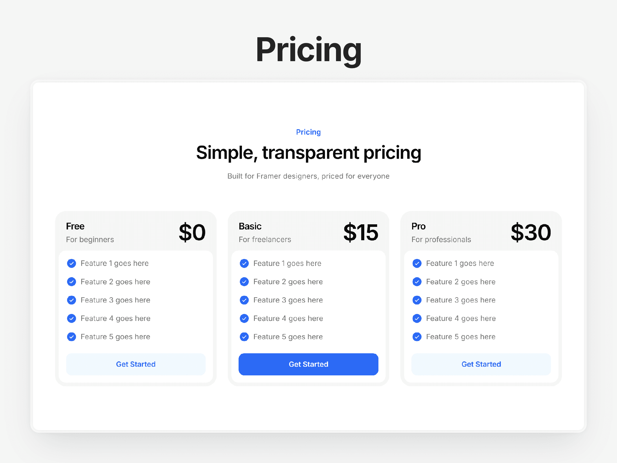
6. Pricing Section
Keep it simple: 3 tiers max, with one clear “recommended” plan.
Add short labels (like “Best for startups”) to help guide visitors to the right option.
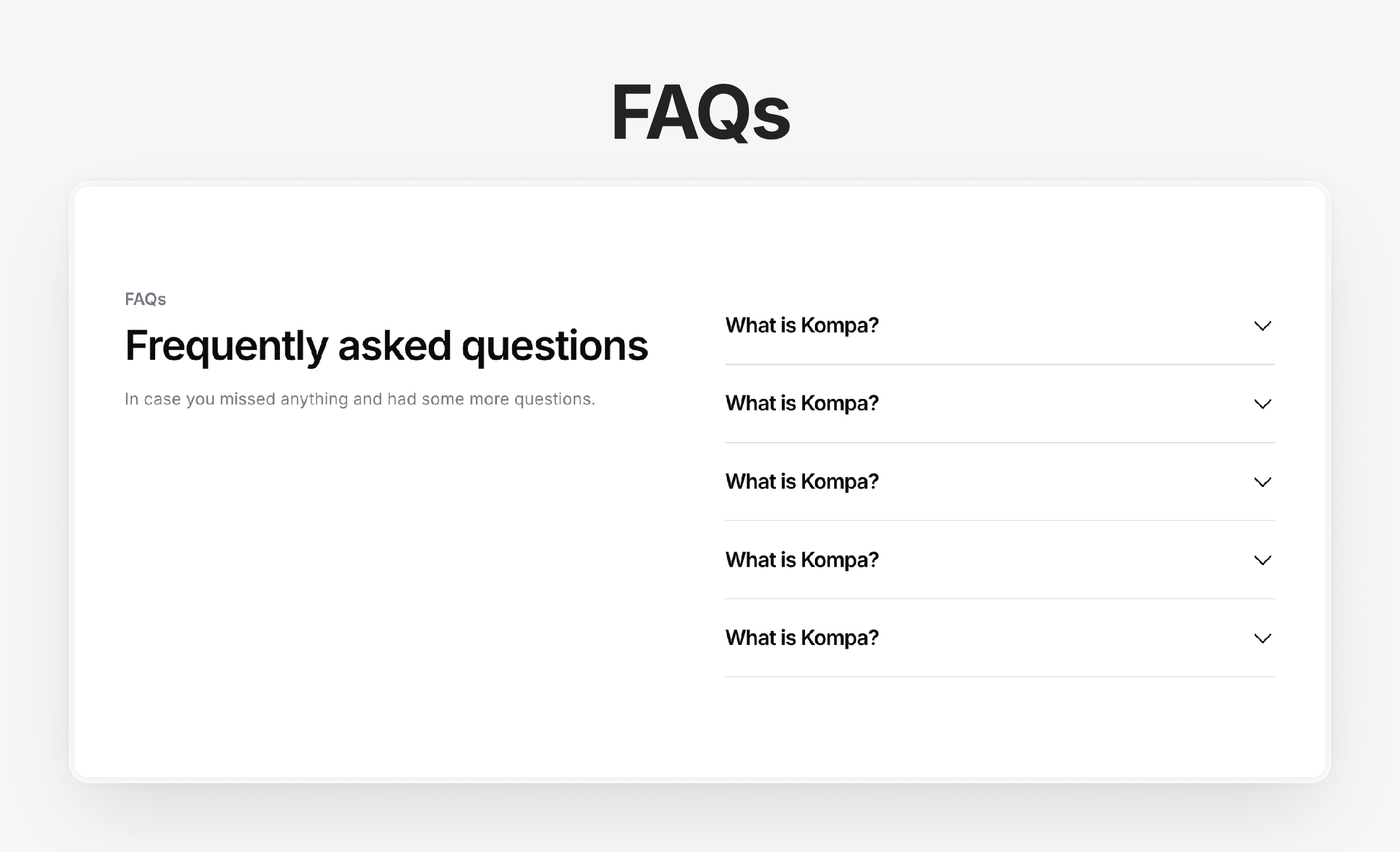
7. FAQ Section
SaaS buyers always have questions — “Can I cancel anytime?” “Do you offer discounts?”
Answer them before they click away.
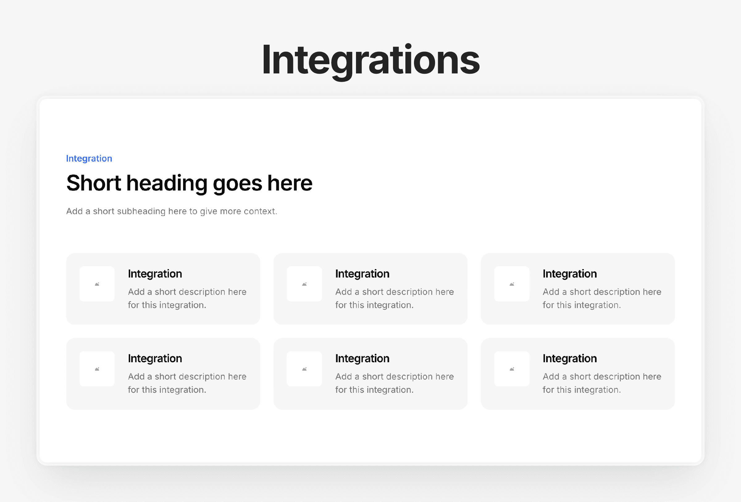
8. Integrations Section
If your product connects with others (like Slack, Zapier, or Notion), showcase it.
It’s one of the easiest ways to boost perceived value.
👉 See more Integrations sections
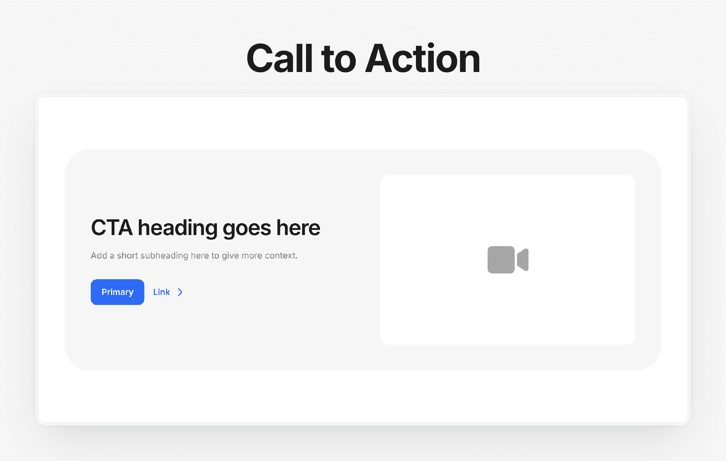
9. Call-to-Action Section
Your CTA should appear multiple times throughout the page, not just once.
Make it bold, simple, and action-focused — “Start free trial” or “Get started.”
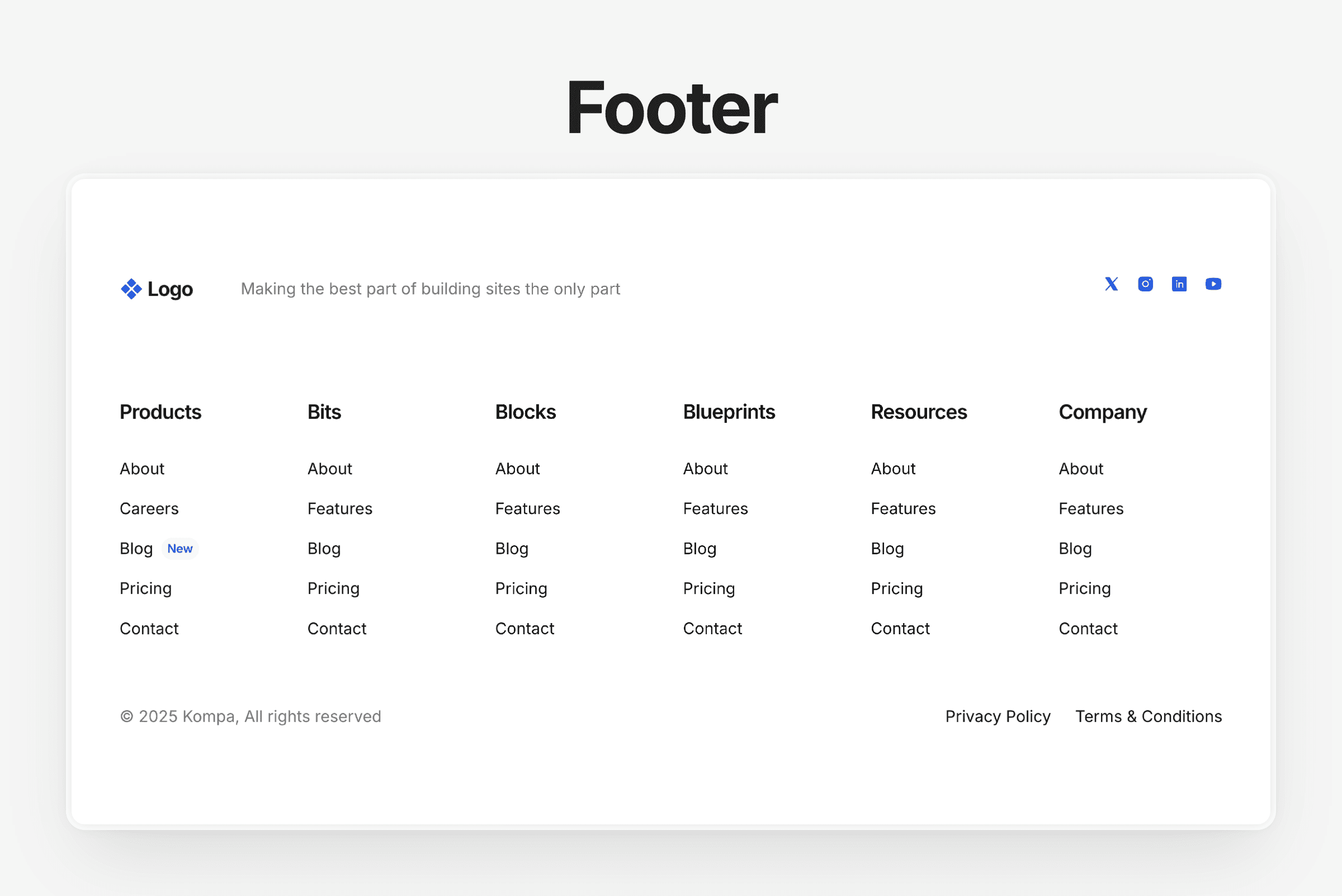
10. Footer
A good footer is simple, consistent, and helpful.
Include links to docs, pricing, contact, and social accounts.
Why use Kompa for your next saas site
Designing a SaaS website from scratch in Framer can take days.
With Kompa, it takes minutes.
You get:
900+ responsive components and sections
Instantly responsive layouts — drag, drop, done
Smart color and typescale tools to match your brand
SEO-optimized components
Lifetime access for a one-time payment of $129
That’s why even the Framer team uses Kompa to build demo sites fast.
Final thoughts
If your SaaS site isn’t built to guide users clearly from problem → solution → sign-up, it’s losing conversions.
Use these 10 sections as your foundation — and if you want to build faster without rebuilding layouts from scratch, Kompa has everything you need, ready to drop straight into Framer.
TLDR
Every successful SaaS site follows a proven structure.
You need sections like navigation, hero, features, pricing, and testimonials.
Each section helps guide visitors from awareness → trust → conversion.
Kompa includes all these sections (and 900+ more) ready to drag into Framer.
Used by the Framer team, Kompa saves freelancers and agencies hours per project.
If you’re building a SaaS website in Framer, there’s one thing you’ll notice fast — every great site follows a similar structure. Whether it’s Notion, Figma, or Linear, the pages look clean, fast, and familiar. Why? Because SaaS sites aren’t about being flashy — they’re about clarity, flow, and trust. Here are 10 sections every SaaS website needs (and how you can drag them straight into your project using Kompa
1. Navigation
Your navbar is the first (and often last) thing people click.
It should be clean, predictable, and work seamlessly on every device.
Keep it simple — a logo on the left, a few key links, and one clear call-to-action button (like “Get Started”).
2. Hero Section
This is where you earn a visitor’s attention in under 3 seconds.
Your hero should clearly explain what your product does, who it’s for, and include a single call-to-action.
3. Feature Overview
Your features should be short, visual, and easy to scan.
Avoid walls of text — focus on how your product helps users, not just what it does.
4. Product Showcase
Show, don’t tell.
Add screenshots, short loops, or before-and-after sliders to demonstrate your product in action.
👉 See more product showcase sections
5. Social Proof / Testimonials
Real quotes from real users = instant credibility.
Keep them short and include names, photos, and company logos if possible.
👉 See more testimonials sections
6. Pricing Section
Keep it simple: 3 tiers max, with one clear “recommended” plan.
Add short labels (like “Best for startups”) to help guide visitors to the right option.
7. FAQ Section
SaaS buyers always have questions — “Can I cancel anytime?” “Do you offer discounts?”
Answer them before they click away.
8. Integrations Section
If your product connects with others (like Slack, Zapier, or Notion), showcase it.
It’s one of the easiest ways to boost perceived value.
👉 See more Integrations sections
9. Call-to-Action Section
Your CTA should appear multiple times throughout the page, not just once.
Make it bold, simple, and action-focused — “Start free trial” or “Get started.”
10. Footer
A good footer is simple, consistent, and helpful.
Include links to docs, pricing, contact, and social accounts.
Why use Kompa for your next saas site
Designing a SaaS website from scratch in Framer can take days.
With Kompa, it takes minutes.
You get:
900+ responsive components and sections
Instantly responsive layouts — drag, drop, done
Smart color and typescale tools to match your brand
SEO-optimized components
Lifetime access for a one-time payment of $129
That’s why even the Framer team uses Kompa to build demo sites fast.
Final thoughts
If your SaaS site isn’t built to guide users clearly from problem → solution → sign-up, it’s losing conversions.
Use these 10 sections as your foundation — and if you want to build faster without rebuilding layouts from scratch, Kompa has everything you need, ready to drop straight into Framer.
Design like a pro. Ship like a team.
Kompa gives you the largest, fastest-growing UI system for Framer. Built for serious scale. Try it free.
Design like a pro. Ship like a team.
Kompa gives you the largest, fastest-growing UI system for Framer. Built for serious scale. Try it free.
Design like a pro. Ship like a team.
Kompa gives you the largest, fastest-growing UI system for Framer. Built for serious scale. Try it free.